Image Analysis with the Tidyverse
Background
Cell Death Assay
Up to now we have been playing with some sample datasets that don’t really apply to our field specifically. Flowers, cars, and airplanes, all make great examples, but it’s harder to see how to directly apply what you are learning in your daily workflow. So, to bring it back directly to biology, we will be using some data that I collected.
The Assay
In this assay cells are stained with fluorescent dyes and then counted on the microscope automatically. The total number of cells per image is reported as either DAPI + (alive) or Sytox Green + (dead). This assay is used to evaluate cell death directly in a 96-well culture dish.
The Data
- replicates: n = 4
- treatments: glucose dilution curve
- 0.0g/L
- 1.0g/L
- 1.5g/L
- 2.0g/L
- 2.5g/L
- 3.0g/L
- 3.5g/L
- 4.0g/L
- 4.5g/L
- sheet 1: no myelin treatment
- sheet 2: myelin treatment
- time point: single 24hr measurement
Goals
- read in the data in excel book
- format the data
- add new variables
- perform statistics
- graph outputs
Data Import and Manipulation
The readxl package is part of the tidyverse that we previously started to explore. Remember that even though you installed the package previously, you still have to load the library every time you want to use it. For more information about the readxl package you can check out the documentation https://cran.r-project.org/web/packages/readxl/readxl.pdf
Change your working directory to where you are keeping your files for this project.
sytox_data <- read_excel("Sytox Data.xlsx", sheet = 1)
head(sytox_data)

## # A tibble: 6 x 3
##   Source                              DAPI Sytox
##   <chr>                              <dbl> <dbl>
## 1 Merged 24Hr No Mye 4.5 glucose.nd2   501   284
## 2 Merged 24Hr No Mye 4.5 glucose.nd2    74   324
## 3 Merged 24Hr No Mye 4.5 glucose.nd2   738    99
## 4 Merged 24Hr No Mye 4.5 glucose.nd2   751   701
## 5 Merged 24Hr No Mye 4.0 glucose.nd2  1209  1015
## 6 Merged 24Hr No Mye 4.0 glucose.nd2  1328  1016
You might notice that when we imported this data frame, the data class that is returned is a tibble. Although we didn’t explicitly state that we wanted a tibble, this is the default import for the read_excel() function. If for some reason you felt so inclined, you could always coerce this into a standard data.frame.
To perform the manipulations we need, we need to load in the tidyr and dplyr packages that are part of the tidyverse. These will allow us to tidy up our data: remember that this means that each observation is in its own row with each variable in its own column. To get each variable in its own column, we will use the separate() function to split the file name into the variables we need.
Had I thought ahead when naming the files in the first place, I would have used better nomenclature. However, this is real data straight from the microscope so we will deal with it just as it is.
sytox_data = sytox_data %>%
  separate(Source, into = c("drop", 'timepoint', 'treatment', 'myelin', 'glucose', "drop"), sep= ' ', remove = TRUE) %>%
  unite(mye.treatment, c("treatment", "myelin")) %>%
  select(-drop)

head(sytox_data)

## # A tibble: 6 x 5
##   timepoint mye.treatment glucose  DAPI Sytox
##   <chr>     <chr>         <chr>   <dbl> <dbl>
## 1 24Hr      No_Mye        4.5       501   284
## 2 24Hr      No_Mye        4.5        74   324
## 3 24Hr      No_Mye        4.5       738    99
## 4 24Hr      No_Mye        4.5       751   701
## 5 24Hr      No_Mye        4.0      1209  1015
## 6 24Hr      No_Mye        4.0      1328  1016
To determine how many total cells we have and the percentage dead cells per well we have to calculate some new variables. To do this we use the mutate function. This function allows us to perform calculations on specific columns that we define.
Here we create two new columns: “total_cells” and “percent_dead”
sytox_data = sytox_data %>%
  mutate(total_cells = DAPI + Sytox) %>%
  mutate(percent_dead = (Sytox/total_cells)* 100)

head(sytox_data)

## # A tibble: 6 x 7
##   timepoint mye.treatment glucose  DAPI Sytox total_cells percent_dead
##   <chr>     <chr>         <chr>   <dbl> <dbl>       <dbl>        <dbl>
## 1 24Hr      No_Mye        4.5       501   284         785         36.2
## 2 24Hr      No_Mye        4.5        74   324         398         81.4
## 3 24Hr      No_Mye        4.5       738    99         837         11.8
## 4 24Hr      No_Mye        4.5       751   701        1452         48.3
## 5 24Hr      No_Mye        4.0      1209  1015        2224         45.6
## 6 24Hr      No_Mye        4.0      1328  1016        2344         43.3
Summary Function
To get some summary information for plotting, let’s use the summarize function that we previously explored. Since we only have one time point and a single treatment, we will group by glucose concentration.
mean_stats = sytox_data %>%
group_by(glucose) %>%
summarise(percent_dead_mean = mean(percent_dead), sd_percent = sd(percent_dead))
print(mean_stats)
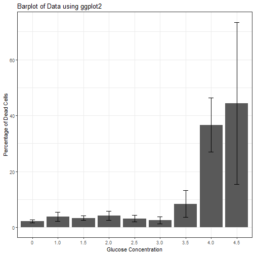
## # A tibble: 9 x 3
## glucose percent_dead_mean sd_percent
## <chr> <dbl> <dbl>
## 1 0 2.19 0.568
## 2 1.0 3.87 1.60
## 3 1.5 3.35 0.824
## 4 2.0 4.26 1.63
## 5 2.5 3.11 1.18
## 6 3.0 2.61 1.25
## 7 3.5 8.39 4.84
## 8 4.0 36.6 9.67
## 9 4.5 44.4 28.9
Use a bargraph to visualize
So, it looks like there is a huge effect from glucose. Lets plot this out to visualize.
ggplot(mean_stats, aes(x= glucose, y =  percent_dead_mean)) +
  geom_bar(stat = "identity") +
  geom_errorbar(aes(ymin=percent_dead_mean-sd_percent, ymax=percent_dead_mean+sd_percent),
                size=.3,    # Thinner lines
                width=.2,
                position=position_dodge(.9)) +
  ylab("Percentage of Dead Cells") +
  xlab("Glucose Concentration") +
  labs(title = "Barplot of Data using ggplot2") +
  theme_bw()
Add the rest of the data from the second sheet
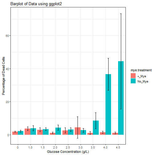
It looks like there is something interesting going on here, but we also want to know how the dead in untreated samples compares those treated with myelin debris.
To do this, lets read in the second sheet in our book and perform the same manipulations and combine it all into one large dataset. To get the second sheet in our book, simply change the sheet argument to sheet = 2.
Note: There is no reason to perform all the manipulations step-wise this time unless for teaching purposes. Notice that all of the manipulations have been piped together. This is best practice and should be done whenever possible.
sytox_data2 <- read_excel("Sytox Data.xlsx", sheet = 2)

sytox_data2 = sytox_data2 %>%
  separate(Source, into = c("drop", 'timepoint', 'treatment', 'myelin', 'glucose', "drop"), sep= ' ', remove = TRUE) %>%
  unite(mye.treatment, c("treatment", "myelin")) %>%
  select(-drop) %>%
  mutate(total_cells = DAPI + Sytox) %>%
  mutate(percent_dead = (Sytox/total_cells)* 100)
Bind the data together
Now that our data is formatted consistently, lets bind it together so that we can look at is as a whole. To do this we use the bind_rows() function. Think of this as basically stacking our data together.
After this we will run our summary functions again to look at everything together.
sytox_data_full = bind_rows(sytox_data, sytox_data2)

mean_stats_full = sytox_data_full %>%
  group_by(glucose, mye.treatment) %>%
  summarise(percent_dead_mean = mean(percent_dead), sd_percent = sd(percent_dead)) %>%
  arrange(mye.treatment)
Note: The arrange argument is used here to present the date grouped by treatment rather than glucose concentration as default. It is only for ease of viewing. Try removing the function to see what happens.
Use a bargraph to visualize the large set
ggplot(mean_stats_full,
       aes(x= glucose, y = percent_dead_mean, fill = mye.treatment)) +
  geom_bar(stat = "identity", position = "dodge") +
  geom_errorbar(aes(ymin=percent_dead_mean-sd_percent, ymax=percent_dead_mean+sd_percent),
                size=.3,    # Thinner lines
                width=.2,
                position = position_dodge(width = 0.9)) +
  ylab("Percentage of Dead Cells") +
  xlab("Glucose Concentration (g/L)") +
  labs(title = "Barplot of Data using ggplot2") +
  theme_bw()
Future Directions
The data looks pretty good so far, but we still need to run some statistics. Right now it looks like there might be an outlier or two that is skewing our data, so we should test to see if we can remove it.